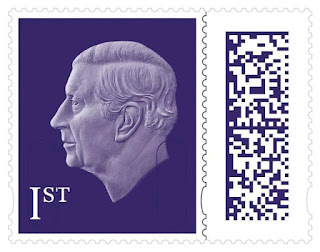
To be released in April 2023 the new Charles III definitives. Do you like them or hate them? Personally I shudder when I look at the design. Instead of trying to copy a 56 year old masterpiece that has been classed as an icon why not just add a up to date photo of Charles?
I am not a keen on the barcode design either, and hate the Elizabeth II bar coded Machin stamps with a passion. I think they are very modern but ugly. But this is just my opinion, others may no doubt disagree As a collector for 60 years from this moment in time I am now just going to concentrate on filling gaps in my existing collections. No more new issues for Mrs Simpsons Lad. .
Conclusion : There will never be another Machin, so why not retire it gracefully?


3 comments:
I'm certainly not keen, not least because the lack of a crown and stopping at the neck means that His Majesty's head is massive compared to his late mother's (all the more so when most people will still have in mind the smaller classic Machin elegance rather than the datamatrixed monstrosities).
In terms of the image used of the King, it is readily comparable with that of, say, the uncrowned head of His Late Majesty King George VI ... but the KG6 stamps had decorative borders (e.g. featuring the flora of the nations of the UK, and a crown) and were altogether more stamp-ish.
I don't regret having drawn a line under my collecting on 8 September 2022.
Why can't this country produce good stamps. These are grotesque.
Likewise - dreadful design…how long have they had to think about this?!! The profile is rubbish, heavy and depressing. The background is too solid - it’s all a total disappointment. Stopped collecting new stamps once the barcoded definitives hit the Post Offices. Am now refocusing on filling gaps in Machins, GB Regionals and Wildings, GB Overprints. Plenty to keep one busy and wallet stressed.
Post a Comment